Sometimes you need an expert eye to add a small detail which can take your current logo to a new level.
Context
AgencyPRO.tools had a logo which worked, but they felt it was too lengthly with lots going on.
The ask was to elevate their exisiting logo and refine the variations of the logo to enable it to work on different platforms and backgrounds.
Details
Time Frame:
2-3 days
Role:
Brand strategist; Designer
Involvement:
Solo project
The Brief
“I just need a bit of help refining a logo and wondered if you’d be able to… get it to a usable state”.
Challenge
The timeline of the project was short. We only had 2 days to turn this around as they had an exhibition which required their branding in the advertising of it.
We were given a few boundaries within to operate:
- Because the brand is a sub-brand, we needed to include 2 companies into 1 logo.
- The rocket icon needed to stay to symbolise the integration into the GHL platform it’s based on
- We couldn’t change the existing colour palette
Approach
We started by analysing the current logo and opportunity areas for improvement. From there we followed our 4 step design process:
- Strip out colour and trial typefaces, balance, proportion and hierarchy
- Create logomark, wordmark and orientation variations
- Select and apply colour palette and styles
- Define rules and package the final options
Results
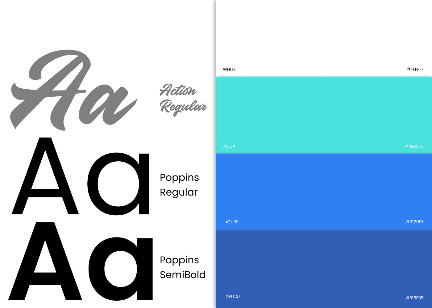
The final design was supplied as a Digital CI Kit, inclusive of an email signature and corporate stationery layout, as well as variations of colour combinations and rules of use. The logo was supplied as a transparent .png file and also as an editable Adobe Illustrator file for future use on different applications.

